Template talk:SCA Kingdom box
From Cunnan
Jump to navigationJump to search
| Lochac | ||||||||
|---|---|---|---|---|---|---|---|---|
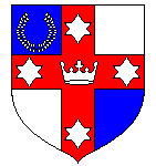
 Quarterly azure and argent, on a cross gules a crown between four mullets of six points, in canton a laurel wreath argent. | ||||||||
| Information | ||||||||
| ||||||||
| Modern location | ||||||||
|
What do people think of this layout (shown at right). - Tobin 01:20, 30 Mar 2005 (CST)
- A very nice start. I've added a mundane location field, because I think we'll need one. I also added a metal field, because it would be nice for each kingdom's two main tinctures to be represented (first colour and first metal mentioned in the blazon. However, here is where my lack of expertise comes in. Some mundane locations are very long. The width of the box will need to be limited (this will be a problem with the blazon too). Also, I'm not sure how to get the background colour to go the width of the box. I'll have a bit of a fiddle. Conrad Leviston 07:06, 30 Mar 2005 (CST)
- Okay, the width command helped the first part of that problem. I have a mock-up for Lochac here now. The black is hard to read on the blue. Can I change the text colour? I'll add a couple of other tweaks, then leave it to see what others think. Conrad Leviston 07:27, 30 Mar 2005 (CST)
- I've done most of the stuff I want to now. The only thing I am not happy with is the fact that the background colour doesn't cover the entire table. I'm pretty sure I've missed something obvious, but am not familiar enough with stylesheets to see it. I'm going to start adding this to the Kingdom pages now. Conrad Leviston 06:53, 13 Apr 2005 (CDT)